How to create an accessible slider component in Ember?
Table of Contents
1 How to create an accessible slider component in Ember?
In this tutorial we will see how to create an accessible slider component in Ember based on the WAI-ARIA authoring practices. A slider is an input where the user selects a value from within a given range. Sliders typically have a slider thumb that can be moved along a bar or track to change the value of the slider.
1.1 Class diagram
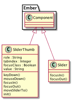
Let us take a look at what are the different things that make up the Slider component in Ember

As you can see, most of the action takes place inside the Slider Thumb component, the Slider component is just a wrapper for the Slider Thumb.
1.2 Component Interface
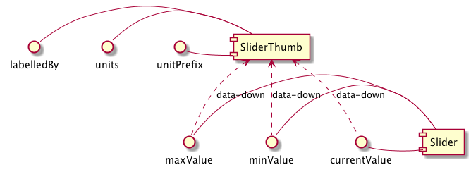
Let us take a look at how the interface for the component looks like:

1.3 aria-slider -> template
This is how the markup / template for the aria-slider component will look like:
  {{aria-slider-thumb
    minValue=minValue
    maxValue=maxValue
    labelledBy=labelledBy
    currentValue=currentValue
  }}


{{currentValue}}
1.4 aria-slider -> component
$ ember g component aria-slider
Let us see how the bare bone structure of the aria-slider component in Ember:
import Component from '@ember/component';
import layout from '../templates/components/aria-slider';

export default Component.extend({
  layout,
});
We need to apply a classname aria-widget-slider to the component. Now the component should look like this:
import Component from '@ember/component';
import layout from '../templates/components/aria-slider';

export default Component.extend({
  layout,
  classNames: \['aria-widget-slider'\]
});
Next, we need to set a class called focus when the focus is set for the component, and remove the same the focus is unset.
import Component from '@ember/component';
import layout from '../templates/components/aria-slider';

export default Component.extend({
  layout,
  classNames: \['aria-widget-slider'\],
  focusIn() {
    this.set('focusClass', 'focus');
  },

  focusOut() {
    this.set('focusClass', '');
  }
});
1.5 aria-slider-thumb -> component
Now we are going to concentrate on the Slider Thumb component.
$ ember g component aria-slider-thumb
We will start with a basic component skeleton in Ember.
import Component from '@ember/component';
import layout from '../templates/components/aria-slider-thumb';

export default Component.extend({
  layout,
});
Next we need to add the necessary classnames and attributes, by means of the classNameBindings and attributeBindings properties for a component in Ember.
import Component from '@ember/component';
import layout from '../templates/components/aria-slider-thumb';

export default Component.extend({
  layout,
  classNames: \['thumb'\],
  classNameBindings: \['focusClass:focus'\],
  attributeBindings: \[
    'currentValue:aria-valuenow',
    'label:aria-label',
    'maxValue:aria-valuemax',
    'minValue:aria-valuemin',
    'role',
    'src',
    'tabindex',
    'valueText:aria-valuetext',
    'labelledBy:aria-labelledby'
  \],
  role: 'slider',
  tabindex: 0,
  focusClass: false,

});
Next we are going to create a computed property called ‘valueText’ which will give you the current value of the slider along with units.
import Component from '@ember/component';
import layout from '../templates/components/aria-slider-thumb';
import { computed } from '@ember/object';

export default Component.extend({
  ...
  valueText: computed('currentValue', function() {
    let units = this.get('units') || '';
    let \_valueText = \`${this.get('currentValue')}${units}\`;
    if(this.get('unitPrefix')){
      \_valueText = \`${units}${this.get('currentValue')}\`;
    }
    return \_valueText;
  }),


});
Now we are going to concentrate on the keyDown event for the component where we will move the slider accordingly based on the keystroke by identifying the KEYCODES First we need to define the keycode mappings using a constant.
const KEYCODES = {
  'left': 37,
  'up': 38,
  'right': 39,
  'down': 40,
  'pageUp': 33,
  'pageDown': 34,
  'end': 35,
  'home': 36
};
Now the implementation of the keyDown event should like the following.
keyDown(event) {
  var flag = false;

  let currentVal = this.get('currentValue');
  switch (event.keyCode) {
    case KEYCODES.left:
    case KEYCODES.down:
      this.moveSliderTo(currentVal - 1);
      flag = true;
      break;

    case KEYCODES.right:
    case KEYCODES.up:
      this.moveSliderTo(currentVal + 1);
      flag = true;
      break;

    case KEYCODES.pageDown:
      this.moveSliderTo(currentVal - 10);
      flag = true;
      break;

    case KEYCODES.pageUp:
      this.moveSliderTo(currentVal + 10);
      flag = true;
      break;

    case KEYCODES.home:
      this.moveSliderTo(this.get('minValue'));
      flag = true;
      break;

    case KEYCODES.end:
      this.moveSliderTo(this.get('maxValue'));
      flag = true;
      break;

    default:
      break;
  }

  if (flag) {
    event.preventDefault();
    event.stopPropagation();
  }
},
Let us add an handler for mouseDown event for the slider-thumb component.
mouseDown(e) {

  let parentNode = e.target.parentNode;
  let minValue = this.get('minValue');
  let maxValue = this.get('maxValue');

  let handleMouseMove = (event) => {

    let diffX = event.pageX - parentNode.offsetLeft;
    let valueNow = minValue + parseInt(((maxValue - minValue) \* diffX) / RAIL\_WIDTH);
    this.moveSliderTo(valueNow);

    event.preventDefault();
    event.stopPropagation();
  };

  var handleMouseUp = function() {
    document.removeEventListener('mousemove', handleMouseMove);
    document.removeEventListener('mouseup', handleMouseUp);
  };

  // bind a mousemove event handler to move pointer
  document.addEventListener('mousemove', handleMouseMove);

  // bind a mouseup event handler to stop tracking mouse movements
  document.addEventListener('mouseup', handleMouseUp);

  e.preventDefault();
  e.stopPropagation();

  // Set focus to the clicked handle
  e.target.focus();
},
Let us add the focusIn and focusOut action handlers also to the component.
focusIn() {
  this.set('focusClass', true);
},

focusOut() {
  this.set('focusClass', false);
},
Let us initialize the component. One thing we have to note here is that once the component is rendered on the page, we should move the thumb to the exact location based on the currentValue property set to the component. This is what we will be doing in the init function of the component.
init() {
  this.\_super(...arguments);
  run.schedule('afterRender', () => {
    this.moveSliderTo(this.get('currentValue'));
  });
},
Now let’s get to the meat of the component, the moveSliderTo method where we will be actually placing the slider-thumb in the exact location using css positioning.
moveSliderTo(value) {
  let minValue = this.get('minValue');
  let maxValue = this.get('maxValue');
  let \_value = value;

  if (value < minValue) {
    \_value = minValue;
  }

  if ( value > maxValue) {
    \_value = maxValue;
  }

  this.set('currentValue', \_value);

  if(value < minValue || value > maxValue) {
    return;
  }
  let pos = Math.round((\_value \* RAIL\_WIDTH) / (maxValue - minValue)) - (THUMB\_WIDTH / 2);

  let left = '';

  left = pos + 'px';

  this.element.style.left = left;

}
As you can see we have used two constants called RAIL_WIDTH and THUMB_WIDTH, let’s define them at the top of the component file as global constants.
import Component from '@ember/component';
import { computed } from '@ember/object';
import layout from '../templates/components/aria-slider-thumb';
import { run } from '@ember/runloop';

const RAIL\_WIDTH = 300;

const THUMB\_WIDTH = 8;
1.6 Source Code
The source code for this addon is hosted on Github
1.7 Demo
There is also a demo available for this addon here