How to create an accessible checkbox component in Ember?
Table of Contents
How to create an accessible checkbox component in Ember?
In this tutorial we will see how to create an accessible checkbox component in Ember based on the WAI-ARIA authoring practices. A checkbox allows the user to toggle between two choices – checked and not checked.
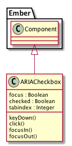
Class diagram
Let us take a look at what are the different things that make up the checkbox component in Ember

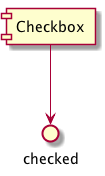
Component Interface
As far as the component properties are concerned, we are having only one property checked for the component to determine whether the checkbox is toggled or not.

Template
The template for this particular component is not having any HTML markup, since it is just going to yield the markup whatever is just given to the component. So the template for this component looks like this:
{{yield}}
And we are looking at a target markup like this when the component is rendered in the page.
Lettuce
Component
Now it is time for look into the component.js for the ember-aria-checkbox component. We will be starting with a bare component skeleton like this:
import Component from '@ember/component';
import { set, get, computed } from '@ember/object';
import layout from '../templates/components/aria-checkbox';

export default Component.extend({
  layout,

});
Next , we will be adding the essential classnames and attributes for the component.
...
export default Component.extend({
  layout,
  classNameBindings: \['focus:focus'\],
  attributeBindings: \['role', 'ariaChecked:aria-checked', 'tabindex'\],
  role: 'checkbox',

});
Next we add a computed property ariaChecked to track the toggled state of the component from the checked property.
export default Component.extend({
...
  ariaChecked: computed('checked', function() {
    return get(this, 'checked') ? 'true' : 'false';
  })
...
});
Then we will be adding the requisite properties for the component to track the toggled and focus states along with the tabindex
export default Component.extend({
...
  focus: false,
  checked: false,
  tabindex: 0,
...
});
Now we shift our focus to the event handling part of the component. First we look at the keyDown events like whenever a particular key is pressed, we will toggle the component state from checked to unchecked and vice-versa. As per the WAI-ARIA recommendations, the SPACE key is used for this purpose as soon as the checkbox got the focus. For that first we need to define the keycode mappings and the handling function for the keyDownevent for the component.
const KEYCODES = {
  'RETURN': 13,
  'SPACE': 32
};

export default Component.extend({
...
  keyDown(e) {
    let flag = false;
    switch(e.keyCode) {
    case KEYCODES.SPACE:
      this.toggleProperty('checked');
      flag = true;
      break;
    default:
      break;
    }

    if(flag) {
      e.stopPropagation();
      e.preventDefault();
    }

  }
...
});
Next the main click handler for the component where we just toggle the component state checked
export default Component.extend({
...
  click() {
    this.toggleProperty('checked');
  }
...
});
Finally, to set the focus classnames for the component, we will be setting the respective property focus to true on focus and false on blur.
export default Component.extend({
...
  focusIn() {
    set(this, 'focus', true);
  },

  focusOut() {
    set(this, 'focus', false);
  }
...
});
Github
The source code for this addon is hosted in Github
Demo
You can also see the component in action here
Author: Rajasegar
Created: 2018-02-16 Fri 10:25